Yay! The swatch-of-randomness for the knitted mandala picture survived its experimental wash-and-block! (Bet you’ve been on the edge of your seats about that one. 😉 ) So. It IS possible to wash-and-block a mixture of rich, inky Fyberspates green, with an innocent little Wendy 5-ply cream. Looooooooook!
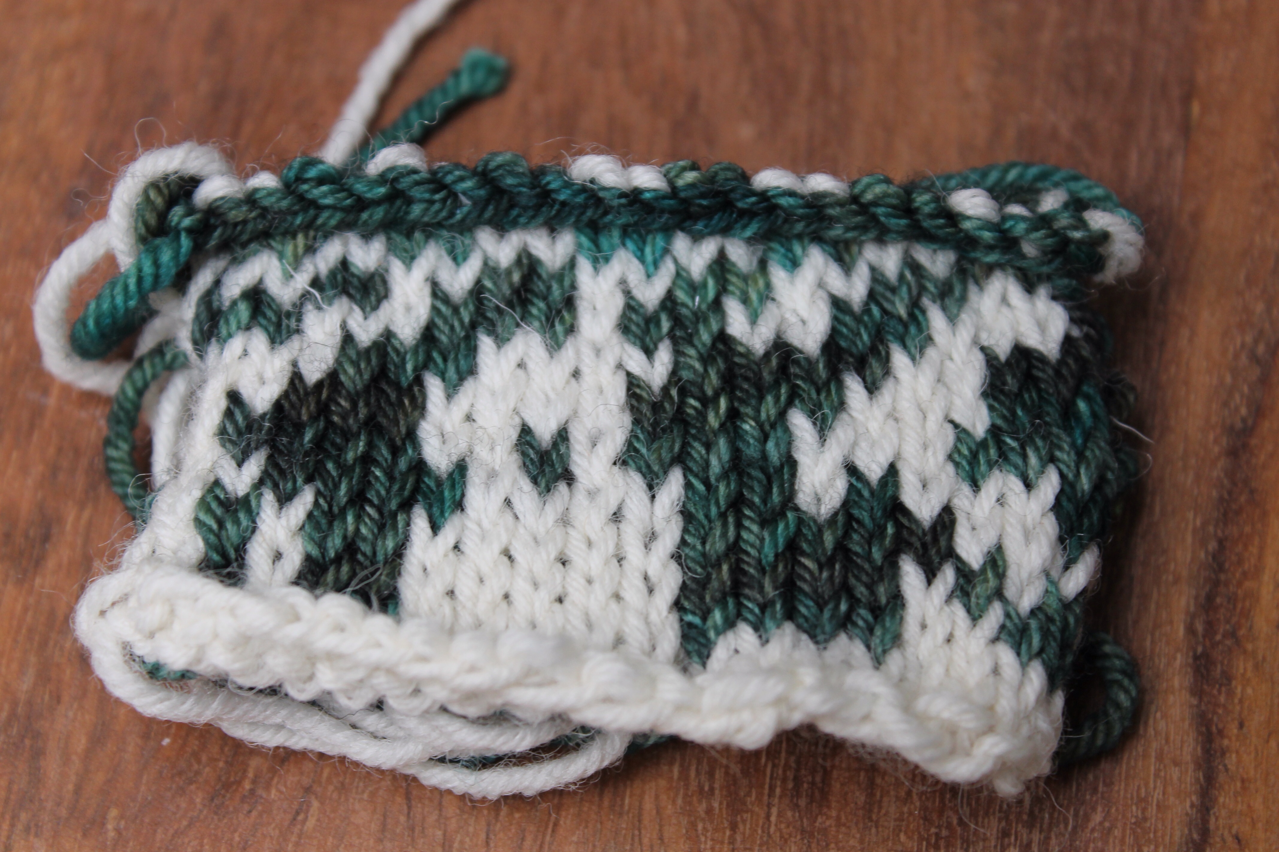
Admittedly, the washing was brief and minimal and in cold water, with a Dylon ‘colour-catcher’ as a precaution. But there didn’t seem to be any dye on the colour-catcher at the end, so maybe I didn’t need it. So, when the mandala is done and the toddler twinnage fling tomato sauce at it it’ll be possible to wash-and-block, in order to even out the stitches of my uneven knitwork.
Now, onwards.
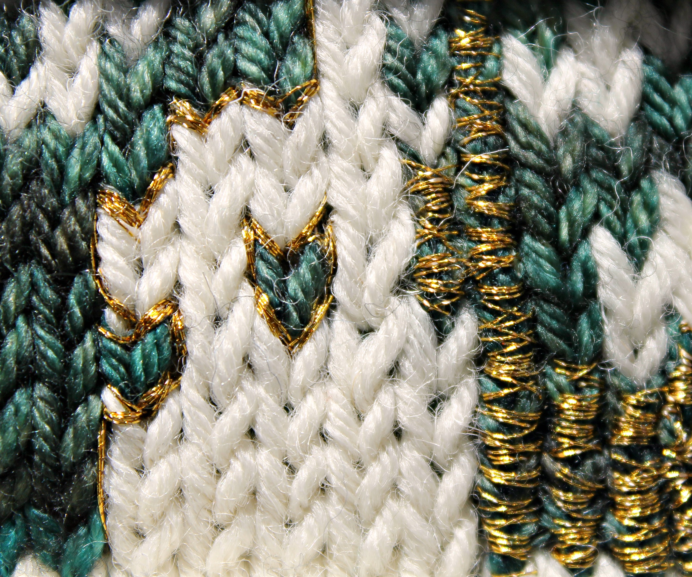
The plan, as we’ve discussed before (have I mentioned how much I love chattering to people on here?) is to embellish the finished mandala picture with a smattering of gold thread. I’m just trying to think how best to do this. The thread I’ve got is probably too fine. In the sample below, I’ve played around with outlining a stitched area, and with over-sewing columns of stitches. Not sure which – if either – works? Any thoughts, please, people? But I definitely need some thicker gold thread, because I had to go over each area many, many times to achieve even this effect. And when you consider that the finished mandala will contain approximately 50 000 knit stitches, you’ll understand why I need to find a slightly more efficient embroidery technique…
Now, on with the knitting…….

Yes, thicker thread is a must! Have you considered beads too? At first glance I liked the gold outline rather than the over and over poles – but then who knows if that wouldn’t look stunning done in carefully chosen areas? The snippet at the top of the post looks pretty darn cool – if you got thicker thread you would lose that effect ………… When you first chatted about the gold thread I was thinking outlines – proving I am often completely challenged when it comes to thinking outside the box…… Glad it didn’t run when washed – and yes, I was hanging out to hear how that went!
So there we have it – do it, don’t do it. Thicker thread or lose the effect. About as helpful as the toddler twinnage at house tidying I assume 🙂
Ha ha, thank you. More to the point, YOUR STORK SCISSORS HAVE ARRIVED!!!
Woo-hoo! Have you chosen your item yet?????
I keep changing my mind! And wondering whether I can accept such generosity.
I’m not selling anything and am most happy to give ’em away! Please, choose something – do me a favour! You were very generous with your offer to send me those delightful scissors – it is only fitting you receive something – unless you really don’t want one!
Oh I would love one. 🙂 Will have another browse…
Long ago I had some metallic gold thread that was like Perle Cotton only metallic – it’s still in the Perle Cotton bin …….. it’s about fingering weight and would be less taxing! I like the picture on the left ……
Ahhh, that sounds more like it. I bought some alternative thread today but am not sure it’ll be suitable.
Lordy, that’s lovely! What a relief that it can be washed–but will the gold thread change that? I like the effect of winding the thread around the columns but I would think you want to use a very light hand–don’t do anything at all that will take away from the gorgeous green!
Yes, you’ve spotted the biggest flaw in my plan. The green is the interesting bit. All that subtle greeny variegation is too lovely to conceal. Hmmm.
So glad it washed ok. Good idea trying it out on a swatch first. Now it won’t be so nerve-wracking when you wash the whole thing.
Love the gold, especially the one that’s wound round and round. It’s just that bit different.
Thank you. I’m slightly scared that it might take the rest of my natural life to work the gold into the real thing, though.
I rather like the outline effect. It gives it a touch of shine without being too in-your-face. Look forward to seeing the end result!
Oh dear, opinions in this comments thread seem divided! 🙂 Thank you, and yes I agree that the outline looks kind of OK.
I think either way of using the gold would work. However, if you want a higher density of the gold, I’d go with the over stitched the columns of stitches (the right side of your picture) because at the size you’re working it would stand out better in the end.
Can’t wait to see how it turns out!
True – good point. It’s so tricky to imagine it upscaled to the final thing, and viewed from several metres away, as it will be. But thank you. 🙂
You’re quite welcome.
I like to think I’m good at seeing the big final picture, and though I can’t accurately judge just how big your mandala is via photograph, if it’s going to be hanging on a wall, I’d want to be able to see the gold from across the room. 🙂
Just on the picture, I prefer the left one. But I agree with the others, who knows how it would look on the whole thing.
Contrasting tomato sauce might look nice too although I guess it is good that the swatch was fine after the washing (sadly I was really really waiting for this post). But what about the gold thread? Will that wash ok as well? I guess another swatch washing needs to be done.
Hmmm, don’t you think that green with red (tomato sauce) might look a bit too Christmassy? Maybe I (or the toddler twinnage) should experiment.
That might be true.Especially in addition with gold. But then you should have thought about that before choosing green for your mandala. Toddler and tomato sauce go hand in hand. always. as far as I know at least.
The gold, green and white look just lovely together. It’s going to be beautiful!
Thank you!
I’m going to add a third opinion and say I think it’s fab as is. No gold!
It’s so tricky to decide….
I should add that I’m also quite lazy. ?
We have something in common. 🙂
Gorgeous design! Thanks for the Like, too!
Thank you. 🙂 And you’re welcome. 🙂
I can honestly say that I trust your choice for what to do about the gold thread. Your design, knitting and sample are all beautiful. You’re making good choices. I look forward to seeing the finished project. I know it’ll be amazing. 🙂
Thank you. But I’m having some doubts. Too late to turn back now, anyway.
I think the gold outline personally. Gives just a hint of sparkle without covering up any of your beautiful knitting! x
Not so much covering up my knitting, but I’m worried about covering up the sheer variegated beauty of the Fyberspates green. Thank you for your thoughts. 🙂
You are great person and you’re very talented??
Awwww, thank you. I can’t agree, but thank you anyway. And your blog is rather lovely. You can sew AND do beautiful things with yarn. 🙂
😉 ok both we are amazing 😀
🙂
I would definitely go for the outline, although I’m biased, as that is how I color with crayons, too. I love those color combinations. Great choices!
Love the wrapped effect of the fine gold. It gives a wonderful random effect to contrast with the ordered pattern. Good luck!
I like the gold outline best. I love the entire piece of course — it’s beautiful!
If you haven’t started using the gold yet, I was wondering if the yarn was strong enough to cope with being crocheted with a fine crochet hook? If you did a long length of chains, you could then use this to highlight as needed. I wonder though, that as you used the chain, it might ‘twist’, and not give as smooth a finish as you might be looking for? I’m new to blogs, and this is my first reply to one …. hope it’s ok!
Ooooh, I likey
Thank you. 🙂
I use those Colour Catchers ALL the time, they are a godsend aren’t they? And they don’t smell like an overpowering sunflowers or something (like the cheaper brands do!) Also I wanted to say I love your blog and I thought that Mandala was AWESOME! 🙂